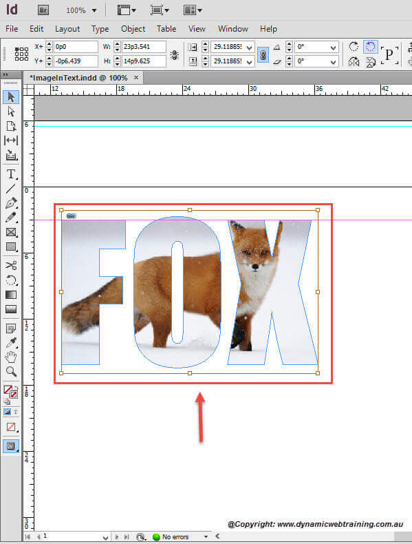
When working with design layouts or artistic covers there are times when you want to be extra creative and have image outlined by text. This tutorial will ensure you understand the ground skills to be able to correctly and efficiently do this.
Steps to Place an Image Inside a Text
STEP 1:
Start by having any InDesign document open that you will be able to use for this tutorial.
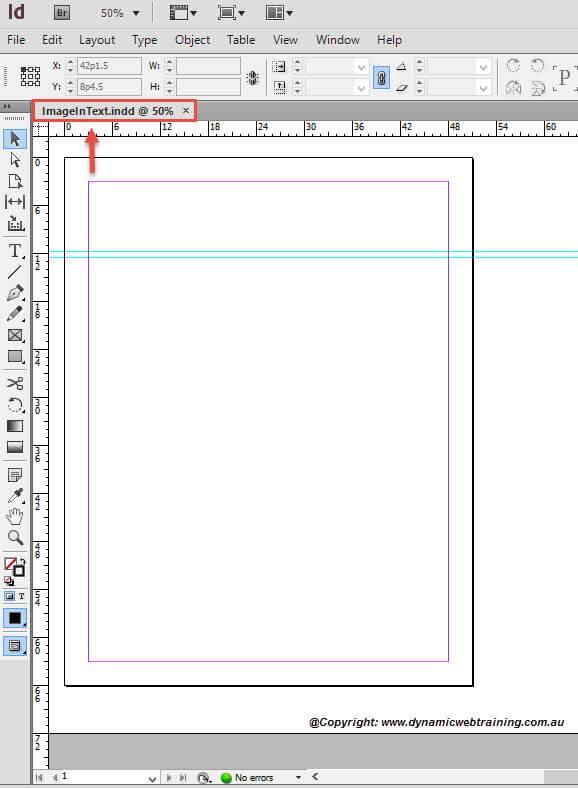
STEP 2:
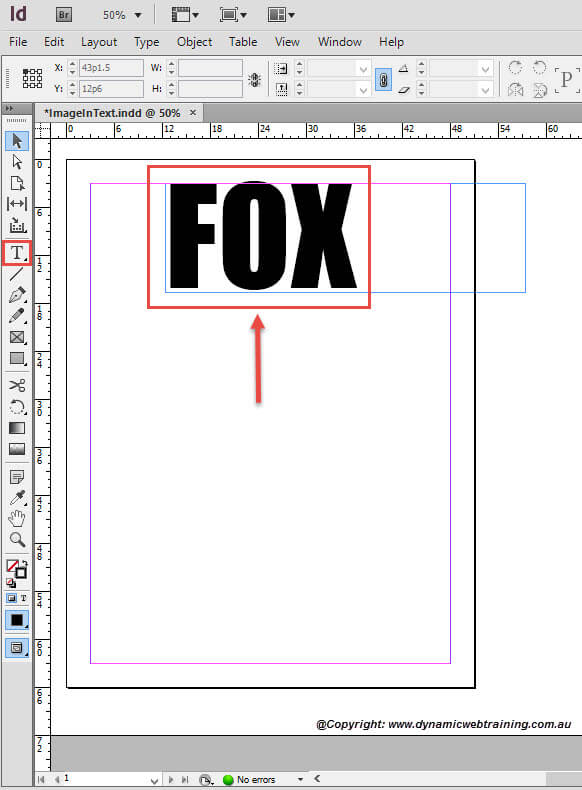
Go ahead and type anything you like on the page and place at the head of the document. There are no restrictions placed when it comes to what font to use and how big the text should be.
For this tutorial, the Font used is Impact and the Size was 300 pt.
STEP 3:
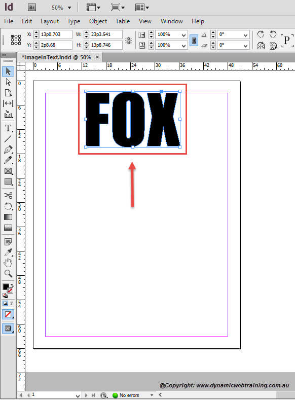
You now need to outline your text and this can be done by going to the Menu Bar, select Type and from the drop down choose Create Outlines.
Note: If you are unsure as to how the Create Outline Tool works, make reference to our ‘Creating an Outline’ blog.
STEP 4:
Once there is an outline to your text you can then choose an image to place within. You can now select your image and place it by using the Adobe Bridge Tool.
Note: If you are unsure as to how the Adobe Bridge Tool works, make reference to our ‘Using Adobe Bridge to Place Graphics’ blog.
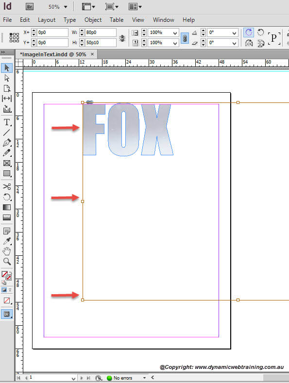
The image has now been placed. However, if the whole image doesn’t show within the text then this means that the image is larger than the text. The orange outline as shown in the fourth snapshot presents the frame of the image as compared to the text.
STEP 5:
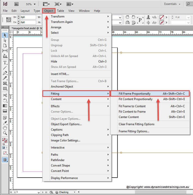
In order to adjust the image to the texts size you will have to go to the Menu Bar, click on Object and from the drop down select Fitting Fit Frame Proportionally.
STEP 6:
Viola! The image has now been resized to the size of your text.
